 |
 |
|
|
|
|
|
| The actual color editing process is introduced from here. For example, three different editing tasks are separately introduced. |
|
| Blue skies are an important element in landscape photography. While enhancing the reproduction of a blue sky taken with the "Neutral" setting, a rich and vivid firmament is created. |
|
 |
|
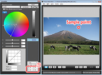
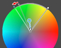
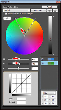
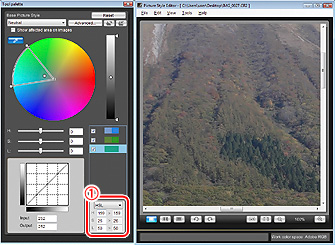
Click on the dropper from the tool palette, and click on an average part of the sky on the main window.
Do not select the brightest or darkest part. |
 |
Input numeric values here to correct the clicked sample point. |
|
|
|
|
|
In the example, the sampled color had an HSL reading of H=220, S=21, L=64. If the saturation (S) is less than 20, or luminosity (L) is more than 80, under extreme editing conditions, a tonal jump may occur, as these values are too close to the outer circumference, so it is recommended to limit the saturation to 20 or more and luminosity to 80 or less as numeric values.
Move the saturation (S) slider to the right, until the sky has your preferred richness and vividness. It was +25 in this example. In this case, luminosity (L) is linked and will be -5. In the selected color information area, it is confirmed that the original luminosity (L) becomes darker (from 64 to 59) while the original saturation (S) becomes more vivid (from 21 to 46). |
Hint for editing blue skies
It is preferable to set the area of influence for the hue, saturation, and luminosity slightly wider, and sample with S being more than 20 and L less than 80.
When specifying a narrower area of influence, the degree of adjustment is reduced. |
|
|
|
|
 |
|
 |
|
The color of the blue sky is not particularly stimulating compared to the Picture Style "Landscape" setting, but it is firm, deep, and vivid. This color was corrected to more closely represent that the photographer remembered.
As the sky became more impressive, the green areas appear somewhat muted. |
|
|
 |
A vivid green is the perfect compliment to blue sky in a scenic shot.
Editing must be done in such a way as to cope with a wide range of greens while taking care not to leave an unnatural impression. |
|
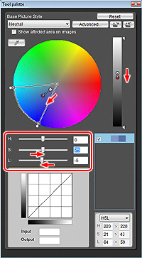
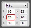
After changing the sky, the greenery is edited. Within the image, take a sample from an average point that you wish to edit. In this example, the saturation was low (S=10), so it was changed to S=20 by amending the numeric value. In addition, the color is rendered more vividly while rotating the hue in the cyan direction, so specify a slightly wider hue in the shift direction, and expand the area of influence for the hue in the cyan direction in order to cope with a wider range of greens and achieve a more subtle change.
In terms of the degree of adjustment, hue (H) = 10 and saturation (S) = 10. At this level, the saturation and luminosity (L) will not be linked. It is within the sampled luminosity (L) =38. |
|
|
|
| As it becomes more vivid by rotating the sampled point towards the cyan direction, so the hue in the area of influence is broadened towards cyan. A wider area of specification in the shift direction provides a way of preventing tonal jump. |
|
|
|
 |
|
 |
|
Sampled color saturation (S) was low (10), so this was changed to S=20 by adjusting the numerical value. |
|
Hints for editing green:
Greenery appears more natural when the hue and saturation between darker and lighter greens are significantly different. For bright greens that are backlit, a yellowish green looks natural, but the yellow component runs counter to dark and vivid greens. Cyan is even stronger with lower saturation for the deep greens of evergreen plants whose leaves are heavily overlaid upon one another. As you became more familiar with using Picture Style Editor, you can categorize per luminosity, which is recommended to take on the challenge of flexible expression of greenery. |
|
|
|
|
|
|
 |
|
| The editing was not as radical as with the blue sky, but the balance between blue and green has improved, and the photo looks more natural. Luminosity is low in parts, and the dark dusty green needs more work. |
|
|
|
| Increase the brightness of the unsaturated dark greens in the distance and offset the variance with the edited green to render it more vividly to create a natural green match. |
|
| Greens in dark areas in the far distance and the green of leaves in the shade of other leaves even at a short distance look darker, saturation is low, and the hue is very close to cyan, so slightly shift them back towards green and adjust them to be brighter and more vivid. Green colors in varying degrees of brightness and tone are mixed, and a more natural impression is created for landscape photography. Not only are the greens rendered more vividly and brighter, but also the simultaneous editing of greens in the darker areas improves the color integration, and the photo looks more natural. |
|
|
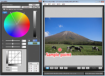
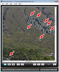
The area of influence for the selected color is indicated. |
|
|
 |
|
|
 |
|
 |
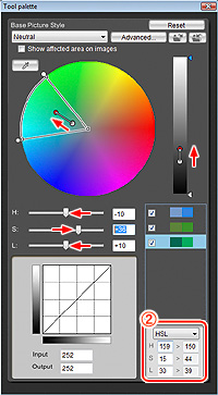
Use the dropper and select a less vivid green that is closer to cyan within the color wheel. H=156, S=26, L=50 was changed to H=156, S=15, L=30 as a numeric value. |
|
Hints for editing greens in dark areas:
Generally, an average green with the medium luminosity of annual grass has a hue (H) of 90~120. Even if H=70~80, fresh green that is backlit does not look unnatural because of its strong vividness and brightness.
In this example, H=159, so it is a rather bluish green, but it is an important color within the scenery. If rendering the greens in the darker areas into a more average shade, it loses its sense of depth looks rather unnatural. Thus, you are recommended to bolster the vividness and brightness while making minimum adjustment to the hue when editing. |
|
|
|
|
|
|
 |
|
The impression of green was rather too strong, but after adjusting green in the darker areas, it looks more natural, and served to enhance the color of the blue sky.
After correcting the color, the range of the highlight tones seems restricted, so they need to be adjusted in the next step. |
|
|
|
|
|
|
