Icon Design System
Designs that Embody Connections
Applications and services work with devices such as cameras to create a diverse range of value. Their starting points are the icons that users see, recognize, and touch. Canon has redesigned the icons of the applications that connect users with camera related software and services.
Icons represent applications and services. They're used in all kinds of media, from smartphones, computers, and websites to printed materials. Camera related software and services are constantly evolving and expanding, so we wanted to create visual communications that tie into the future of camera related software and services. That's the spirit that underlies each of our tiny icons and the spirit with which we've created a design system that will be used for long to come.
What the Boxes Represent
We began by picturing devices that connect to diverse services, the flow of data, and the applications that support this. We based our icon design concept on this vision.
Distinctive graphics that enable users to intuitively understand the roles and functions of applications. A high level of compatibility, not just for Canon but other companies as well, whether it be linking various devices to services or coexisting via the cloud. Flexibility, supporting both current imaging products and future functions and services. A unified look when different applications and services are brought together, forming a united group. These were the concepts we sought to achieve as we carried out a bold redesign within the limited spaces of icons.
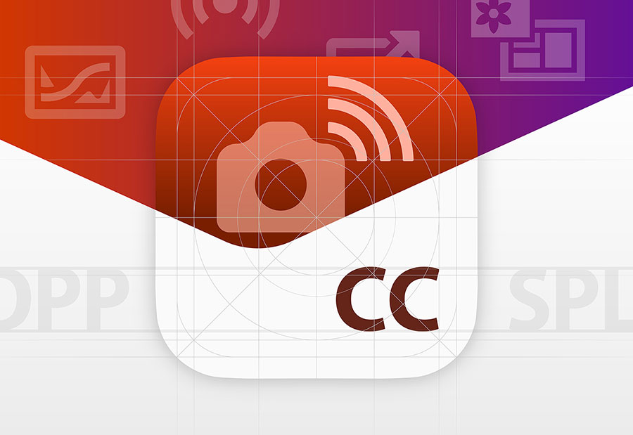
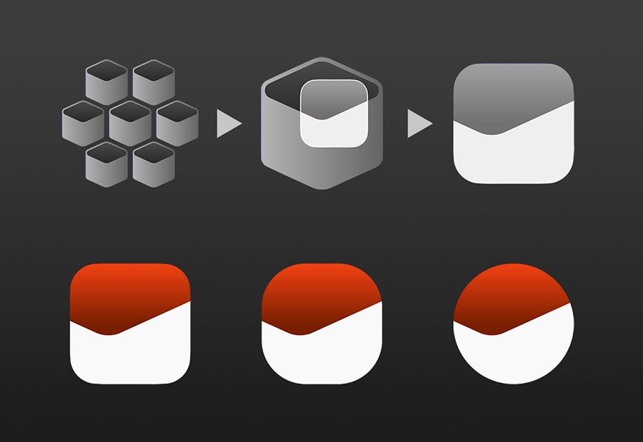
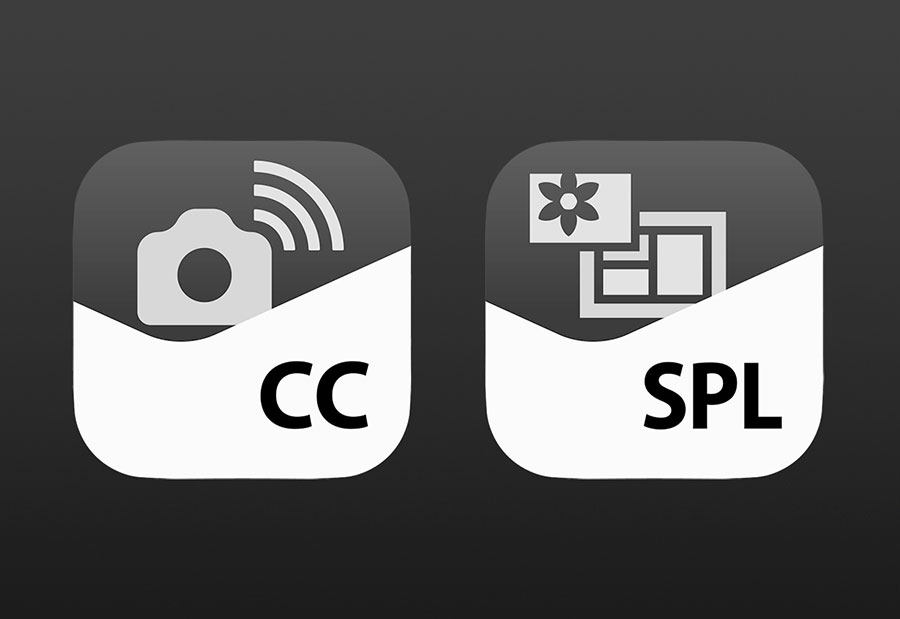
For collections of diverse applications to be recognized as a cohesive group, they need to have shared symbols that show that they are related. Applications are packages of functions, which is why we went with a box motif. The basic structure of the icons shows the functions within peeking their heads out.
The V-shaped design comes from the appearance of a box seen from diagonally above, trimmed dramatically. The line sloping up to the right and the clearly separated color space represent the energy and vigor that support creation.
In developing this shape, we closely scrutinized potential designs while keeping in mind the spirit of Canon that lives within freshness and novelty. The simple straight lines and curves represent the precision, power, and beauty of tools, providing the icons with the same powerful image and individuality as the Canon logo. The box shape is also universal, spanning the lines between different devices, such as computers and smartphones. The box motif was designed to retain its meaning and its compositional balance even when smartphone users change the outlines of the icons.
Pictograms that Evoke Objects and Experiences
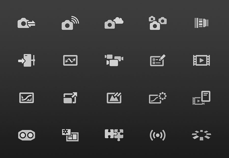
The imaging software icons of the past used illustrations and symbols to represent "objects" that indicated functions and services and the "experiences" that users had when using those objects. These illustrations and symbols were combined together to form the icons, but as products, functions, and services have grown more diverse, icons have become more complex, making it difficult to discern their meanings at a glance.
We decided to boldly narrow down the graphic elements used in the icons, packing pictograms depicting functions within box symbols. Instead of indicating objects and experiences through the use of precise illustrations, we used simple symbols to evoke them, directly conveying the functions of each individual application. These pictograms carry on the feel of the icons used in the GUIs of Canon products, expressing an aesthetic of natural connections between hardware and software. Through a process of trial-and-error, we worked with different object shapes, quantities, sizes, angles, and other design factors to decide what to depict, in what way to depict it, and how strong to make that depiction.
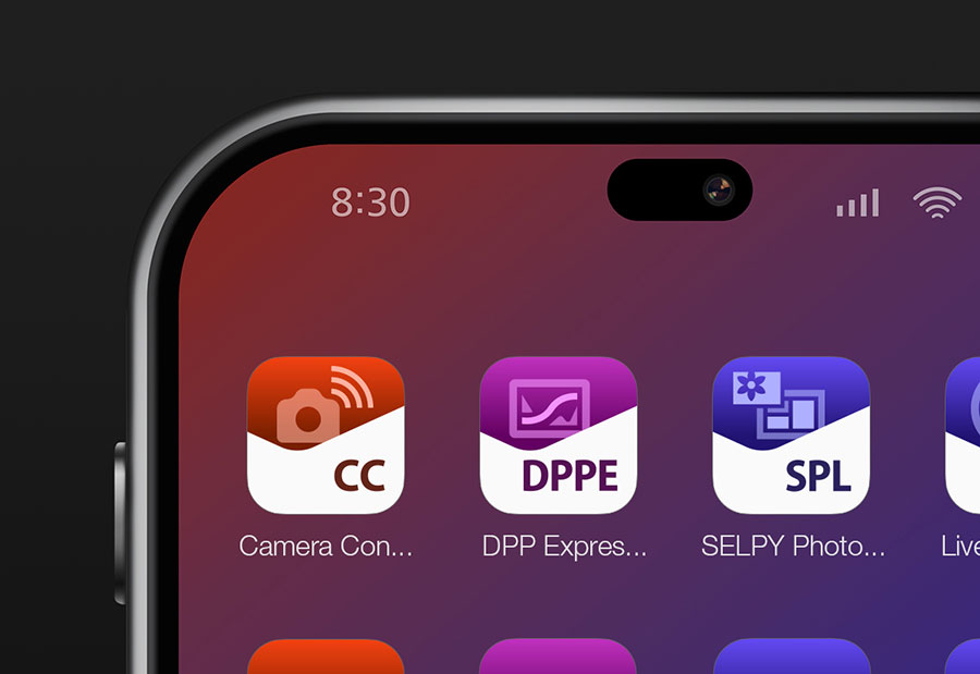
Visual Letters
On devices, the name of each application is shown below its icon. We wanted to visually link those names with our new icons, so we embedded abbreviated, alphabetical representations of their names within the icon design.
These aren't letters to be read, but letters to be seen--"visual letters." The powerful contrast between the V-shaped white space and the letters gives the text a sense of independence and makes it highly visible and visually appealing, all while maintaining the balance with the surrounding white space. These visual letters catch the user's eye, even if the user isn't intentionally reading them. The user's eye is then instantly drawn to the pictogram diagonally above them. These contrasting elements of letters and pictograms fuse, enhancing the impact of the icons and further emphasizing the fundamental functionality of the icons.
If the first thing a user notices are the letters, then the icons' first impressions will all be significantly affected by the letters' shapes, numbers, and alignment. That's why we didn't mechanically place them, but instead refined their placement through an iterative process focused on how the text looked. We sought to create a text arrangement which, when combined with the pictograms, would produce the most striking and memorable icons.
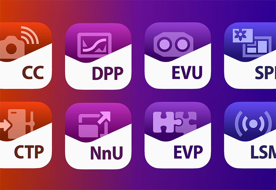
Hues that Tie into Workflows
In designing the colors of the icons, we looked at user workflows, from importing images from devices to editing them and distributing them. We created a color scheme in which each color has its own meaning.
In addition to clearly distinguishing between workflow categories by using different colors for each, we also applied gradations to the icons' hues, such as red or blue, to express how the steps of the workflow connect to each other.
This gentle gradation, from warm colors to cool colors, indicates the workflow, from connecting and controlling devices to editing and utilizing data. The colors, although similar, are distinguishable from each other, enabling users to naturally perceive the continuity between functions and procedures and the relationships between services. When the icons are placed alongside each other, they have a strong identity as a group and a beautiful color gradation, with a rhythm all their own.
We considered the potential for future application additions that would connect or span different categories when defining the color scheme's rules, ensuring that it would be capable of accommodating future workflow expansions.
Design Aligned with Sensibilities
The human eye can play tricks on us. Sometimes an object that is perfectly centered can look askew. Two objects can be objectively exactly identical in size, but one can look larger or smaller than the other. The shapes we see are affected by the elements around them (other shapes and colors), and these can sometimes produce optical illusions. This problem cannot be solved simply by aligning elements and making them uniform. For the intentions of designs to be properly reflected in icons, elements must sometimes be intentionally shifted. Their densities or colors must be changed. Text spacing must be finely tightened. Aspect ratios must be tweaked. Design elements such as these must be optimized on an individual basis.
We created sample after sample, making tiny adjustments until all of the icons' elements were balanced just right. Even after the layout was decided, icon are shrunk down or appear different on different devices, so we performed pixel-by-pixel adjustments on pictograms and text edges based on how the icons actually appeared on devices.
Ultimately, it is people who will look at, recognize, and touch icons. To make sure that our icons were aligned with the sensibilities of the people using them, our designers needed to refine their own sensibilities and diligently work on each individual icon. We see these delicate balance adjustments, based on human sensibilities, as the final piece in perfecting a visual design fit for Canon, so we performed them with great care.
The roles of application icons are changing, from simply serving as symbols for distinguishing between apps and switches for starting apps to elements that shape the impressions people have of apps and create a brand image. They are a new type of visual communication that supports creativity and the "face" of our apps, carrying on Canon's DNA. We hope that they will be popular with many users.
Related Links
Valuing the Stories that Lead to the Answers
Upon joining Canon, I was involved with video equipment. I'm now responsible for the GUI design of medical devices. In my view, design comes from asking yourself questions like "Why does it have to have this shape, this color, this arrangement?" I place great value on the emotional story that leads to the answers to these questions.
Akira Yoshino, Canon Design Center
Art Direction: Hiroshi Goto / Photo: Kei Hayakawa
Canon Design Center
List of Frontline Content
Adastra
varioPRINT iX1700
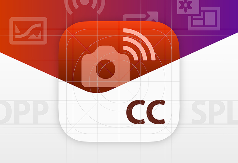
Icon Design System
EOS R5 Mark II
EOS R1